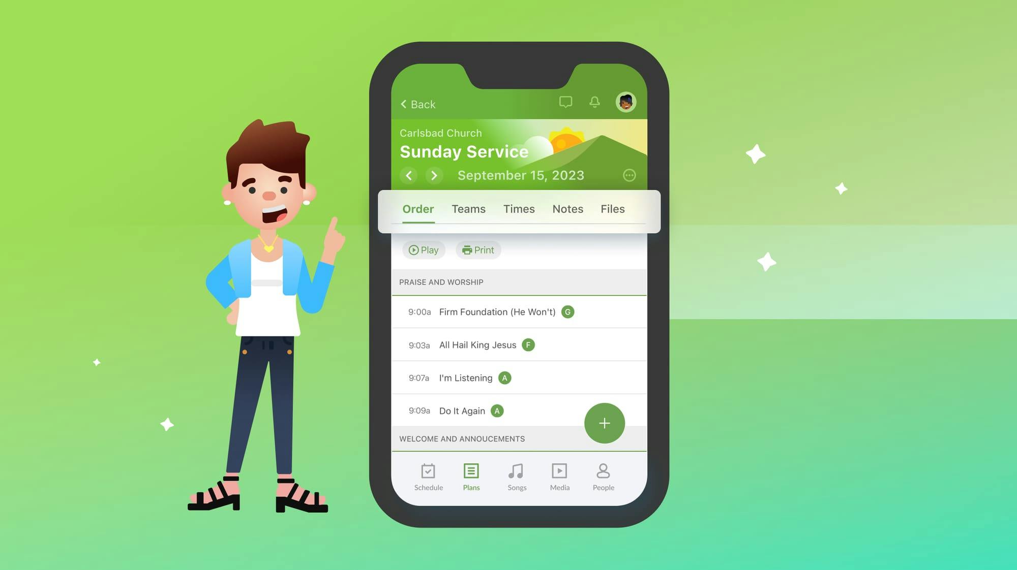
Many of you spend a lot of time on the plans page in the Services mobile app. Yeah, you can find what you’re looking for and complete tasks, but it hasn’t been very smooth.
After hearing your feedback, we've redesigned the mobile app’s plans page to offer a more intuitive and efficient experience!
So, what exactly has changed? Let’s dive in.
First, the big picture:
The previous design had rows for each major section—Order, Teams, Time, Notes, and Files—that you'd tap to go into each sub-page. Navigating between sections required a lot of back and forth, which could get cumbersome.
The new design reconfigures those sub-pages into tabs, making it lightning-fast to switch between sections. You'll see more of what you need right on the first page, and it matches what you’re used to on desktop.
Now for some details:
- The app remembers which tab you were on and starts you there for new plans
- The menu button has general actions like renaming, printing, starting Services Live, or opening the plan in another app
- Tab actions are now buttons below each tab
- Services Live is always accessible in the header menu, with an extra Live button on the day of your plan (if you have permission to start it)

Version 6 of the Services app is now live for Android and iOS, and we're super excited to get this updated plans page into your hands. This redesign will simplify your workflow and create a cohesive experience across devices. Plus, it sets the stage for some thrilling new features coming up—so stay tuned!
💚 Team Services
