In the past couple of weeks, we’ve had much to celebrate. Not only did we hit our 10-year anniversary, but we also proudly announced our newest app, Planning Center Groups. Because we believe omne trium perfectum, we are proud to announce our new Planning Center logo.

Some History
When we launched in the summer of 2006, we used the logo below. At that time, Planning Center was both the name of the company and a single app, and the clipboard was a symbol of organization and structure.

Shortly after, we updated that logo to have a more nuanced design aesthetic.

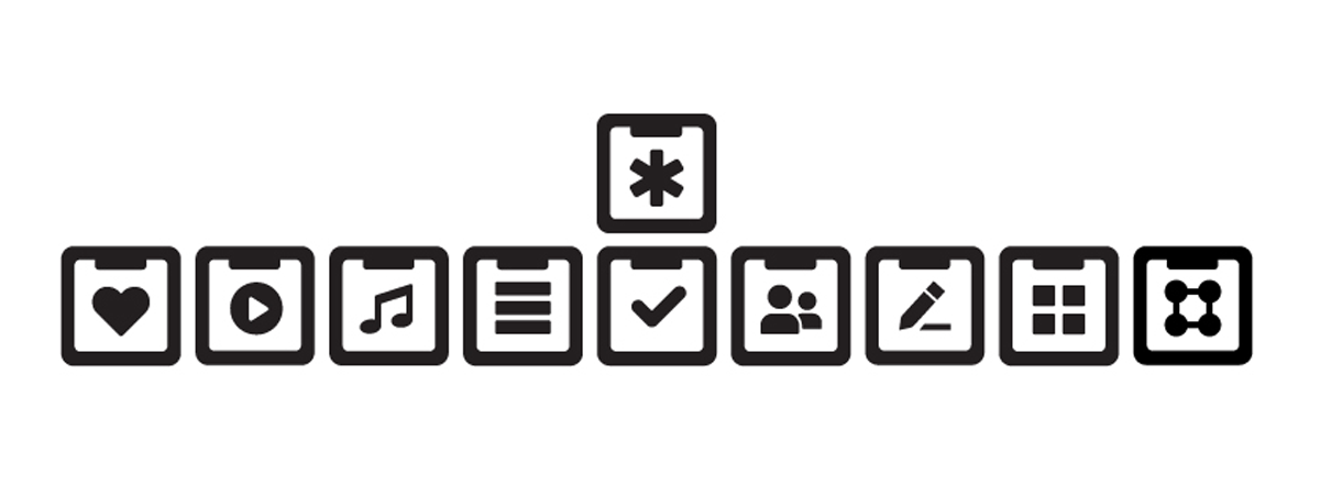
The second major iteration of the logo ushered in a flat design and additional versatility. A one-color logo travels better than full color logos with multiple gradients and can be applied to a greater variety of presentation materials while maintaining its visual integrity. Notice that the implied clipboard image was carried over to all of our icons, and the image at the center of each clipboard communicated the ministry tool. The Services app adopted the horizontal bars that were originally on the main logo from Planning Center’s early years.

This logo has served us well and will be immortalized in the myriad of t-shirts, hoodies, and swag gifts that we store at Planning Center’s secret mountain fortress.
If It’s So Great, Then Why Change?
When we launched 10 years ago, our single app was a tool that changed the way thousands of churches planned their Sunday services. The result was that it prompted countless users to ask us to create additional apps that would help them in other areas of their day-to-day ministry.
What began as one app has now grown into a suite of seven apps that are designed to meet ministry needs within the church. In an effort to visually delineate between the parent company (Planning Center) and the apps under the parent company (Services, Check Ins, Resources, Registrations, Giving, People, and Groups), we believe that the parent company should have its own unique and symbolic identity. Note, if you look at the image below, you can see that the Planning Center logo at the top could be easily confused with the individual app logos below it.

If you’ve been a Planning Center user for more than a few months, you’ll know that we regularly update our apps to make them better all the time. It’s that same desire for excellence that prompted us to evaluate our branding and our current logo to see if we could strengthen them. Once we set the project in motion, we tasked our awesome design team with shaping its direction.
Shane, our lead designer, put together a summary of the rationale behind our new logo.
The adjectives that served as the baseline for the process were: Stable, Friendly, Approachable, Powerful, Intuitive, Simplified Complexity.
In homage to the old Planning Center logo, we took the asterisk and extended it out to form the six vertices of the hexagon. These six points represent the company vision of having 6 applications to serve our churches. OK… technically 7, but that’s where the ‘P’ comes in.
The ‘P’ at the center of the hexagon represents Planning Center People, as people are at the center of all that we do. The icon and logotype have been softened by rounding all the corners, giving the mark a more friendly, approachable feel. In order to communicate simplified complexity, the ‘P’ was folded, intimating 3 dimensions and not simply a flat icon.
![]()
So there you have it. A new logo and a fresh look! I wish I could invite you all to come to our offices and see for yourselves how excited we are for this new logo and its significance to this next season of Planning Center. If you’ve ever seen dozens of people celebrate Christmas in July, then you know what we look like these days. The new logo rollout starts today, so you’ll see it appear on our sites, social media, print campaigns, and swag in the next few months. And, you can start pricing out your “vintage Planning Center” t-shirts on your eBay auctions, too.
:quality(80))