Well, I think it's time to take the wraps off a huge new project that will take Planning Center Services to the next level. We could call it something like Services version 3, but since PCO Services is constantly being updated, that doesn't really communicate it well. So instead, our code name for it is Services "Evergreen". (Other code names like Emerald City & Kermit's Revenge were rejected.)
Ancient History
First, a little backstory. PCO Services is approaching its 10-year anniversary. In 2006 when it was first released, it was using some of the latest web technologies to function as a full application, when most software was still obtained by buying a CD-ROM, virtually unaware of the internet. 2015's most popular internet browser, Google Chrome, didn't even exist for two more years. PCO Services was built to be compatible with Internet Explorer 6 (now 11/Edge), Safari 2 (now 9), & Firefox 1 (now 42).
We've updated PCO Services very frequently over the years, with a couple of notable app-wide design updates to refresh its look. We've also taken advantage of some of the new technologies available in modern browsers, but as a whole, we're still tied down to a lot of older code that can often impede new projects. Plus, an extra incentive for us is that our other Planning Center apps are built with a unified framework that PCO Services doesn't support.
To Infinity and Beyond
Earlier in 2015 we decided that it was time to bite the bullet. We needed to figure out how to rebuild PCO Services to set it up for the future. With much thought, we came up with a clear list of objectives.
New Design. To fit in to the family of Planning Center apps, and to stay up to date, the entire app will be getting a (sometimes dramatic) design update.
Don't Alienate Users. PCO Services is a complex product with passionate users that have already taken considerable time setting things up and getting in a rhythm. Change breaks that rhythm. As a result, any changes, especially the dramatic ones, need to give each user plenty of time to adjust.
Learning Phase. To help users acclimate to the change, each page will have a learning phase, where for at least one month, users can switch between the new-and-improved design, and the old-and-familiar design.
Page by Page. You don't want to learn an entire new app all at once, and we certainly can't make it that fast. We'll be tackling one page at a time over the next year or so.
Add Features. New can be scary, so we're taking extra time to build in some of the most requested features to each page to make it more exciting, and because that's just what we do.
Make it Easier. We've had almost 10 years of user feedback, so we know which areas on each page cause the most confusion. Making it easier using features, design, and inline help is one of our top priorities.
Optimize for Mobile. 10 years ago, touch screen devices barely existed. Services Evergreen will be built to run smoothly whether you navigate with a mouse or your finger, and no matter what size device.
We've actually already released two "Evergreen" updates: Blockout Dates and Email Composing. Though their design was updated dramatically, we didn't think there would be much confusion on how to use them, or where things were located, so there was no trial period.
Sneak Peek
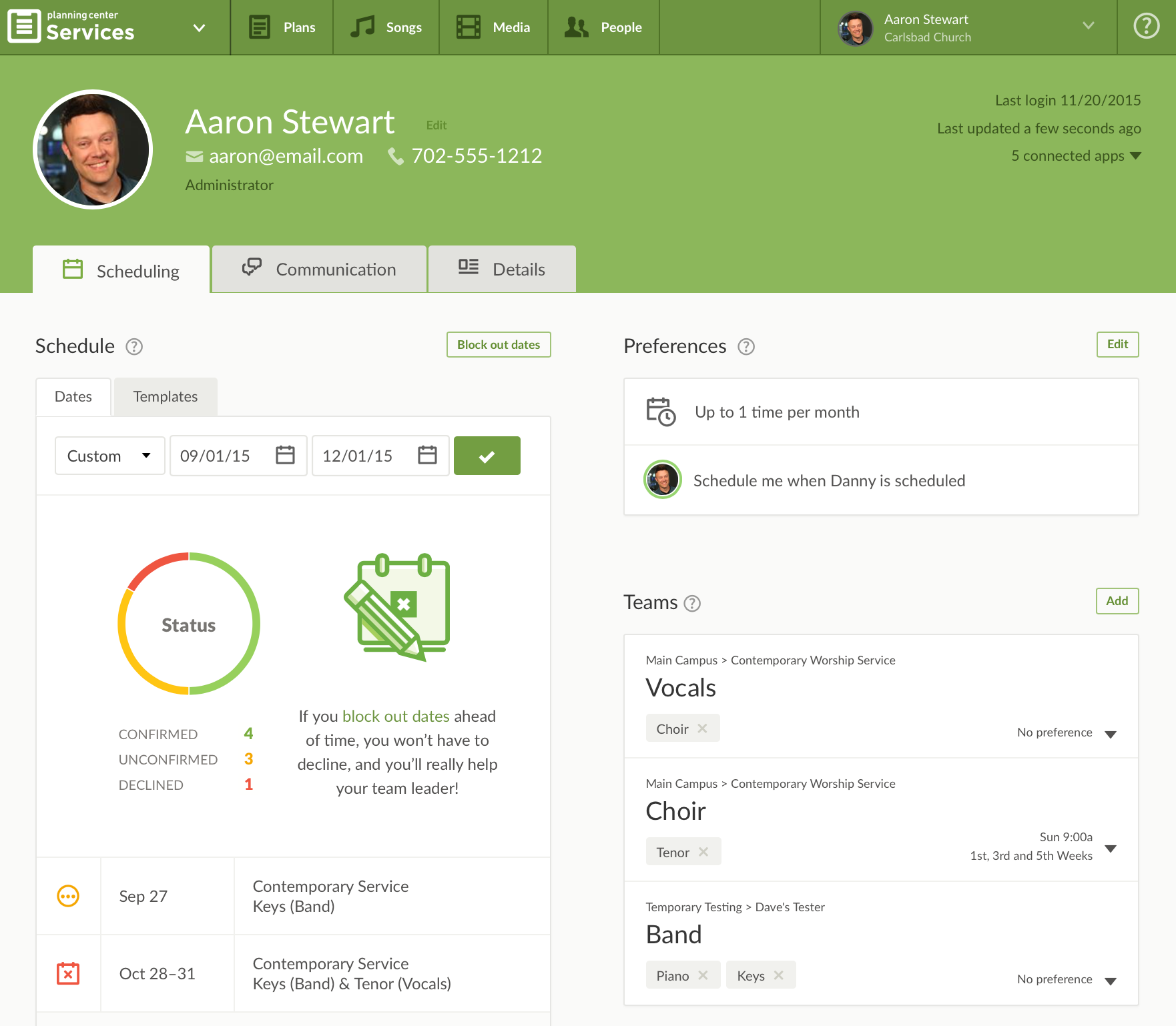
We're days away from releasing the first full new "Evergreen" page. We decided to start with a page that's important, but that you probably don't spend a lot of time on, the Profile page. (It also happened to be the most cluttered page, furthest from the clean design we value so much.)
The new profile page has a ton of great new stuff and will get its own blog post soon. You'll have plenty of time to get used to it, and to let us know what you think before it becomes the only option. For now, here's a sneak peek!

We're extremely excited for all of Services Evergreen and can't wait for you to start using the first page. This next year is going to be fun!
:quality(80))