Our first full page for Services Evergreen is here! What is Services Evergreen, you ask? In short, it's a year-long project where we update every page in PCO Services, one page at a time, and give it a modern, simplified design, while adding some of the most requested features. You can learn more about Services Evergreen in this blog post.
The profile page was one of the most cluttered pages, so we decided it was a great place to start. It's now organized into tabs and should be much easier to navigate. In addition, we've taken great care with each section to make previously complicated tasks a lot simpler using subtle animations, enhanced functionality, and explanatory text that appears just when you need it.
General
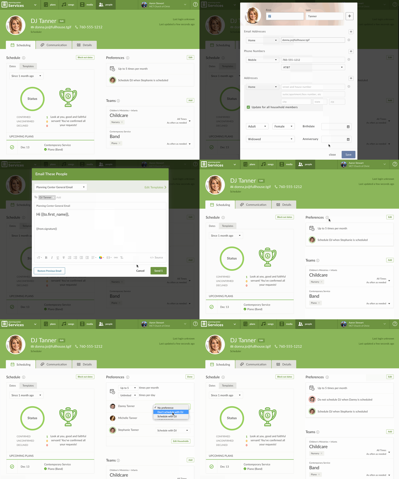 We've put the most important information about each person right in the header, including their email, phone number, and highest permission. If you're a Scheduler, clicking the email starts a new message to that user, and clicking the permission switches you to the Details tab where permissions are set.
Now that Planning Center can be used as a full Church Management System, we wanted to make it more clear that a person's profile in PCO Services is just the subset of their information related to scheduling. Our free membership app, PCO People, is at the heart of all Planning Center apps, and is where a person's contact info is actually stored. Now, no matter what PCO app you are using, when you click to edit a person's contact info, you'll get the same popup box.
Two other general things you'll see frequently are Helper Shelves and Inline Saving. Most section headers have Helper Shelves, an (i) you can click which reveals text explaining that section, often with a link to more information. Inline Saving means that as you make changes, they're either saved automatically, or after clicking a save button in that specific section. Both methods show an animation confirming the save.
Scheduling
The Scheduling tab is visible when users visit their own profile, and to all Schedulers.
Schedule
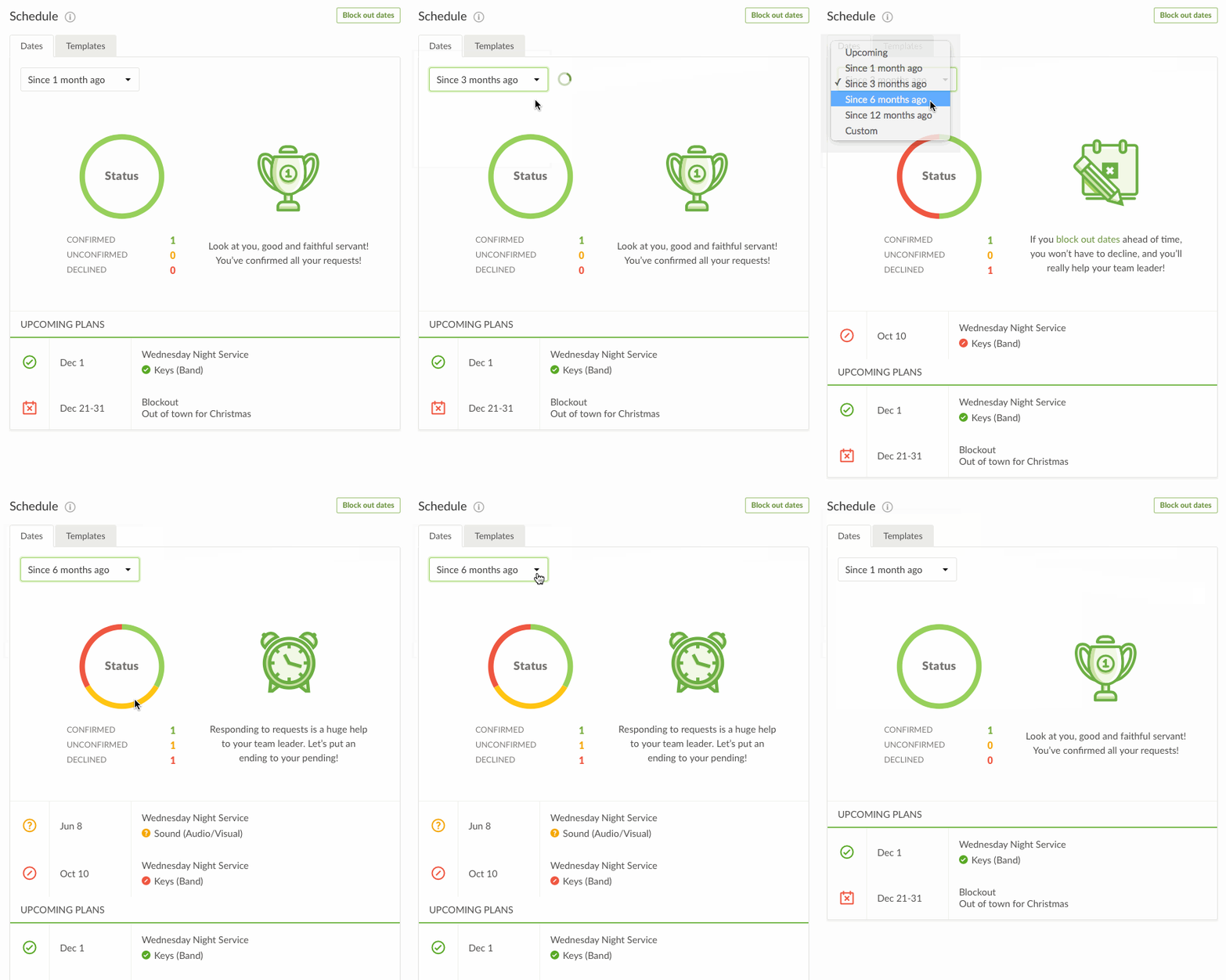 The first section on the Scheduling tab is the Schedule, which is where you can see all plans & blockout dates related to a person. If you're a Scheduler, you'll also see a Templates tab which shows all templates that user is a part of.
The first thing you'll notice is a great new status section with a graph that shows you a summary of how often a person has confirmed, declined, or just hasn't responded during a date range. You can even hover over the graph to see the percentages. There are messages to the right of the graph that change based on those percentages, congratulating you for accepting everything, or reminding you to block out dates if you decline a lot, for instance.
By default, the graph shows the schedule starting 1 month ago and extending to everything planned in the future. You can quickly change the dates to start 3, 6 or 12 months ago using our predefined options, or you can choose Custom to specify any start or end dates.
Preferences
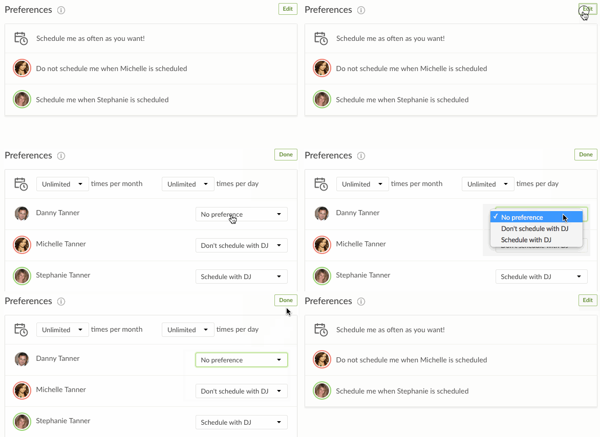 The preferences area is where a team member can set how often they prefer to serve. We haven't added any new features here, but it does look much simpler than before. In the default view, you only see preferences that are actually set. When you click to edit, it expands to show you all available options.
Teams
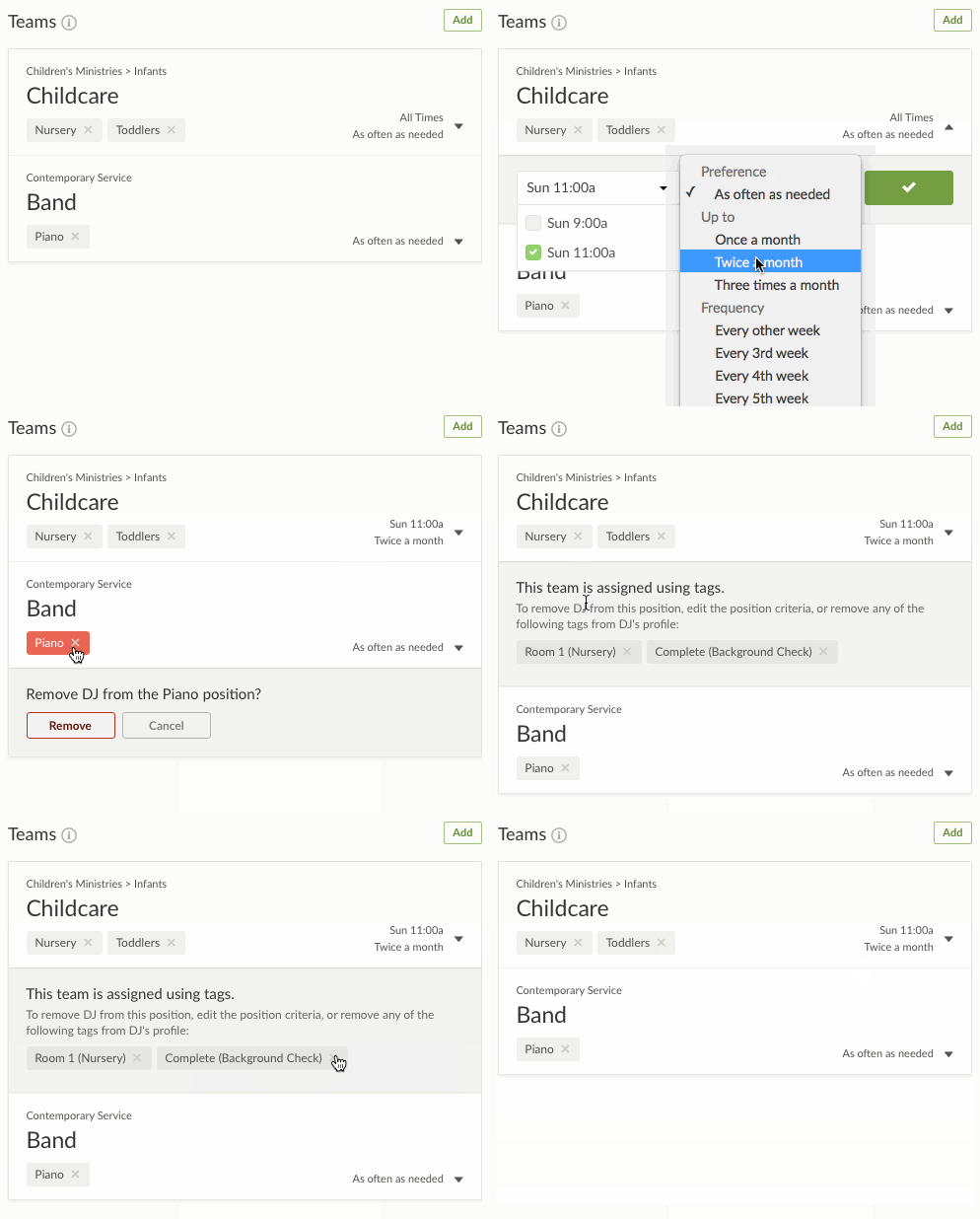 Teams has gotten the biggest update of anything on the profile page and is now much more powerful, mainly by showing all Teams. There are two main ways to set up each team, and before today, you could only see the Teams configured to assign people directly, which was confusing. Now you see Teams configured to assign people using Tags, too!
Since Teams assigned using Tags are now shown, they can also finally have preferences set! No matter what kind of Team a person is on, they can specify how often they'd like to serve on that particular team.
Removing people from Positions happens differently based on the type of Team. If it's set to assign people directly, a simple message slides out asking you to confirm. If you try to remove someone from a Position on a team that is assigned using Tags, you'll get a message letting you know you'll have to remove some of their tags, which you can do right from there!
Communications
The Communications tab is visible when users visit their own profile, and to all Schedulers. The only things hidden from Viewers are the button to send a new email, and the Signature section.
Messages
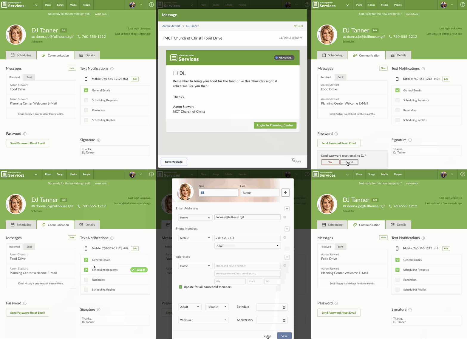 Each user has an inbox and outbox for messages that go through Planning Center. By default they show the 5 most recent, but you can click the button at the bottom to load more right in place. If you have at least Scheduler permissions, you'll also have the "New" button to send an email to that person using our improved Email Composer.
Password
Um, this helps you reset someone's password. What more do you want? ;)
Text Notifications
You've been able to set up text notifications for years now, but it wasn't obvious because you wouldn't see the option until after adding a mobile phone number, which you might not ever do. Now we're clearly labeling that section to expose the functionality sooner. Clicking edit brings up your global contact information where you can add your mobile phone number and carrier.
Details
The Details tab is only visible to Schedulers, Editors, and Administrators. When Viewers visit their own profile, they do not see this tab at all.
Permissions
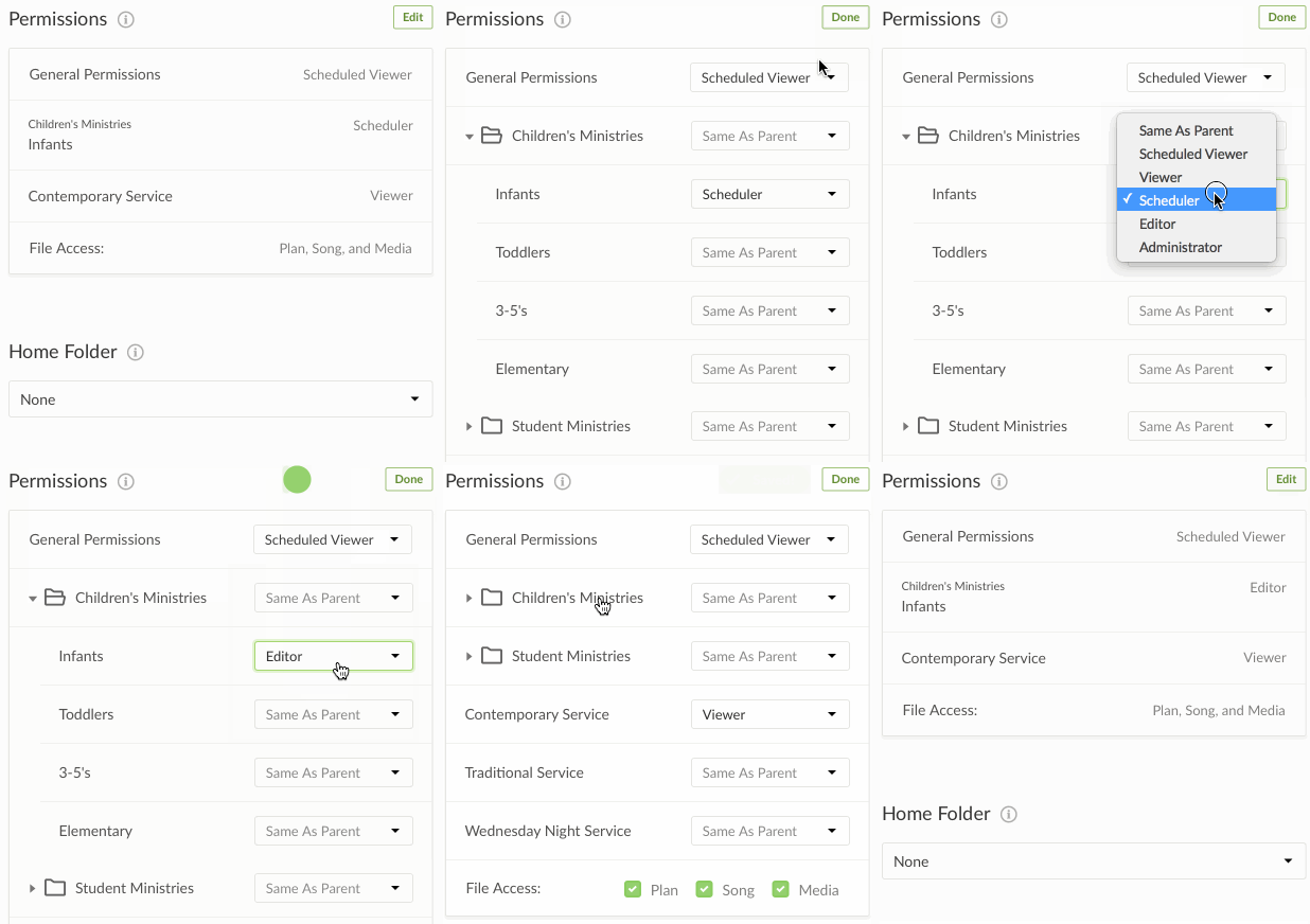 Permissions themselves don't have any new functionality, but the way we display them makes it vastly more easy to manage. Now, by default, we only show you permissions that are actually set. Any permissions that are "Same as Parent" which means they are the same as the folder they're in, aren't shown.
When you click edit, we show you all Folders & Service Types in your account. It used to be difficult to find the specific permission you were looking for, especially in large accounts. To make that easier, when you click edit, we keep all folders closed unless they have a set permission inside. In addition, we gray out any that are "Same as Parent" so you can easily scroll down the page and spot the important ones.
Home Folder
The Home Folder is one of our relatively newer features that helps larger accounts. When adding a new Scheduler, Editor, or Administrator, you can set their Home Folder, so that when they log in, they are taken directly to that folder. Nothing has changed with the Home Folder.
Remove Person
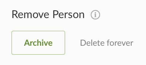 This is an entirely new section, though it doesn't provide new functionality. When a user is no longer serving, we recommend you Archive their account rather than delete them, so their history is preserved. You can do this by changing their permissions, but since that's not always obvious, we've added this new section which also allows Administrators to completely delete unused accounts.
Tags
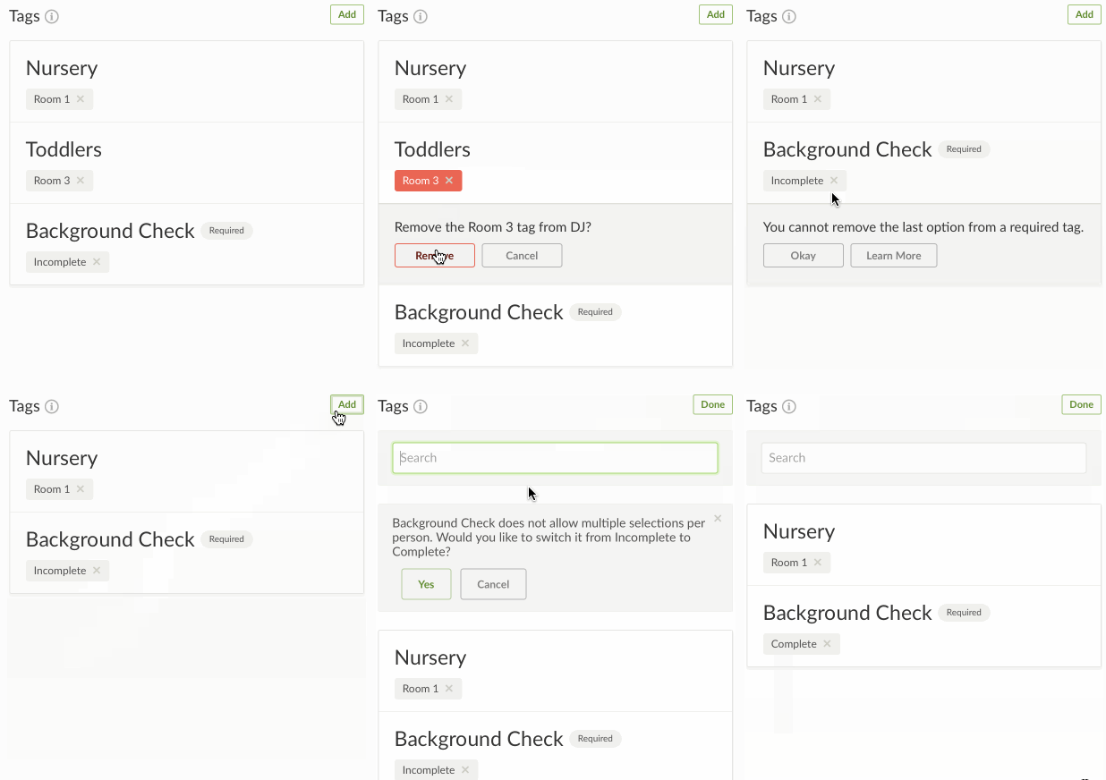 There are 3 small improvements to Tags. First, if any Tag Group is required, it has a badge showing that. Second, if you try to delete the last option from a required Tag, you'll get a message telling you why that's no longer possible. And last, if a Tag Group has been set to only allow a single option, we'll actually enforce that from the profile page (go figure). If you try to add a second option, you'll get a message asking if you'd like to switch to your new option instead of the old one.
Notes
When you schedule someone using Needed Positions, you'll also see notes for each person which are entered here. It's pretty self-explanatory, but we can point out that to keep the interface clean, the Save and Cancel buttons are only shown once you actually click in the field. Clicking Cancel will revert to your original text.
Files
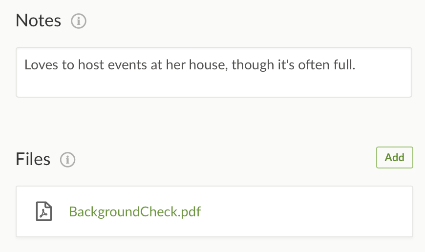 You might not have even realized there's a place to attach a file to a person. Not many people use this functionality, and now that you can do the same thing in PCO People, there's even less of a reason. Nevertheless, it's still here. Click the 'Add' button to locate a file, or just drag a file from your computer anywhere on the profile page.
Previously, the user could access files you uploaded to their profile, but in this new version, files are on the Details tab and therefore only accessible to Schedulers, Editors and Administrators.
Beta Period
For the first week or so, only Schedulers, Editors and Administrators will be able to access the new Profile page. You can switch using the toolbar at the top of any profile page. Starting next week, we'll allow any user to switch over. At that point, all users will be able to switch back and forth between the old and new versions until mid-January, making sure we don't force you into this somewhat drastic change until you've had a chance to explore it.

If you do find any issues with the new page, or you just want to tell us what you think, just use the big question mark at the top right of the toolbar to send us your feedback. We hope you like it!
:quality(80))