You want to make it simple for people to engage with your content and ministries online.
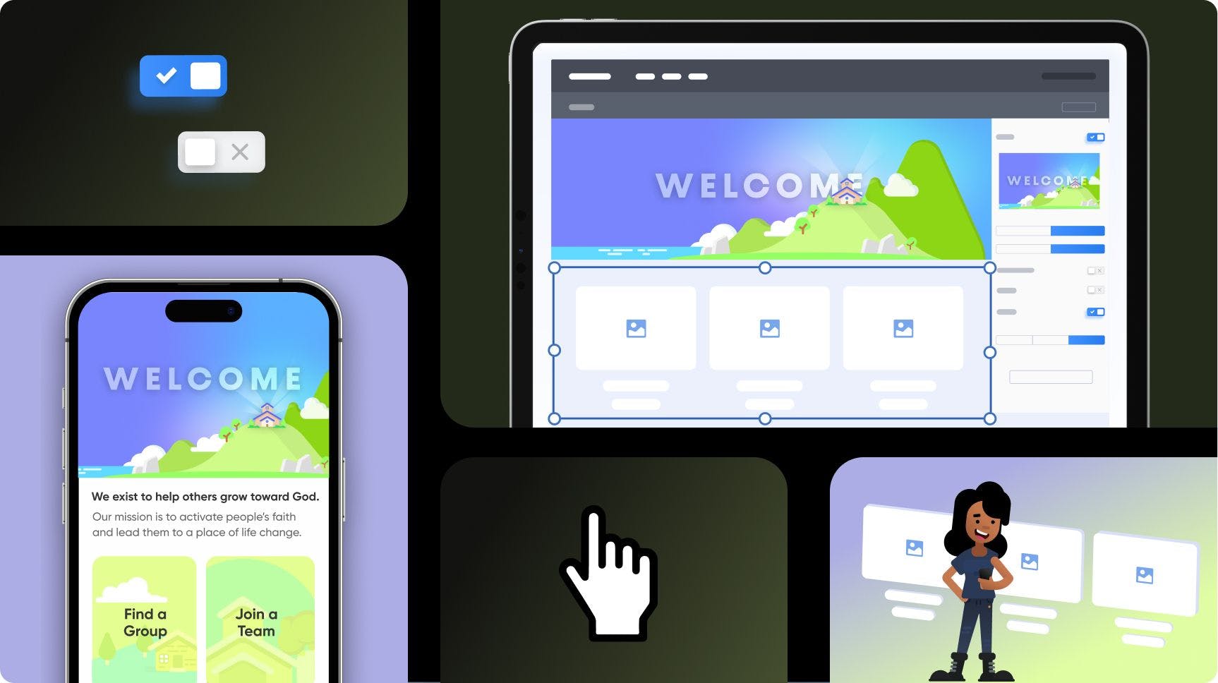
The grid block layout option is a new way for you to creatively present content on your Church Center app and web!
Check out the video for a walk-through of how it works!
With the grid block, you can:
- Use pre-built sections to lay your content out into columns and rows.
- Make up to three columns of content next to each other, and as many rows as you want!
- Include buttons, images, and text in the grid.
- Set a unique number of rows or columns for the app, and then something different for the web.
- Have fun playing with different layouts!

This is a big step forward for Publishing as a web editor, and we hope that it helps you find new ways to make Church Center yours!
Send us what you make, we’d love to see it!
🖤 Planning Center Publishing
